

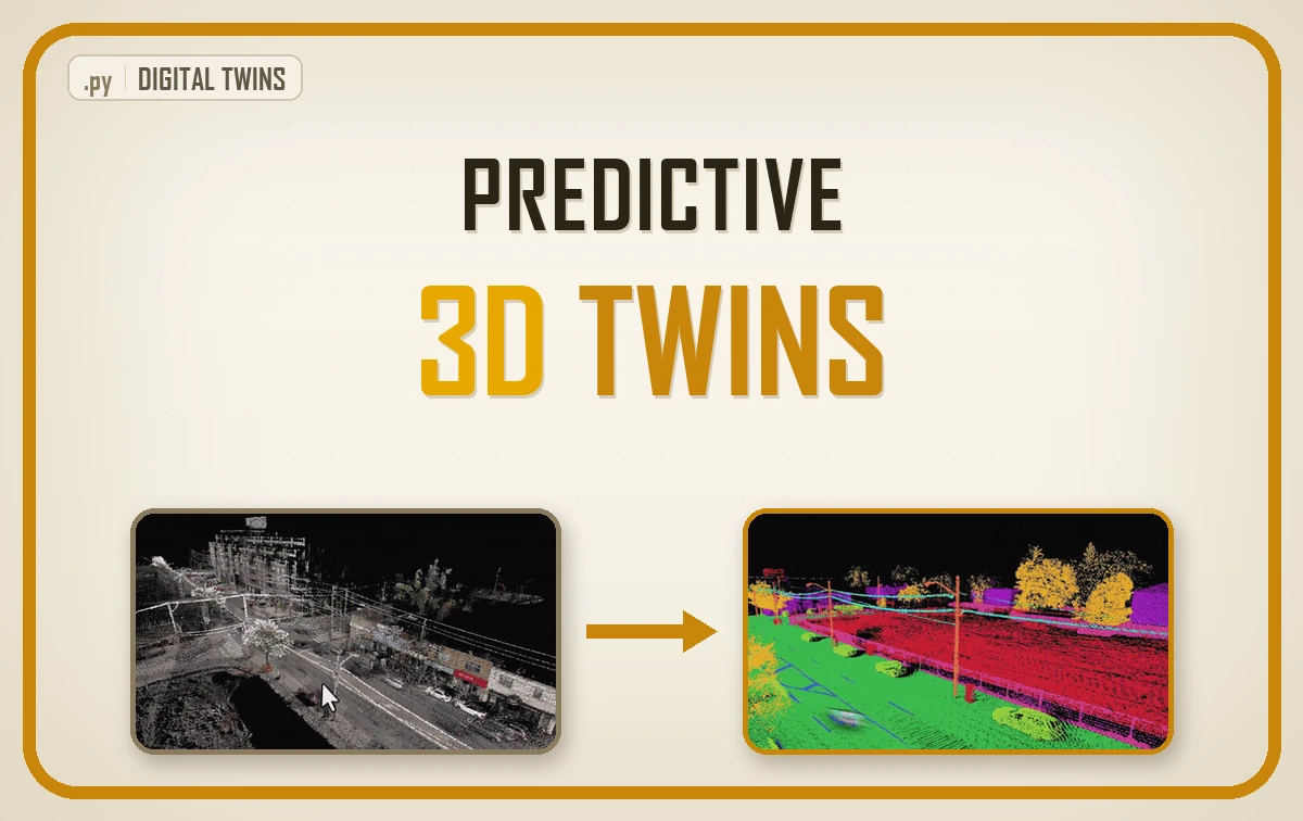
A predictive digital twin holds a model of a real asset and rolls it forward in time, so it answers questions about future dates rather than reporting the last survey. It runs on five inputs: geometry, radiometry, topology, time, and a policy that decides what counts as failure and what a repair costs.
| What it is | A model of a real asset rolled forward in time, so it prices next year’s risk instead of reporting the last survey |
| What you build | Asset cells, a defensible condition index, a graph, a declared decay mechanism, a forecaster in plain PyTorch, and a work order that stops at a budget line |
| Libraries | laspy, SciPy, networkx, PyTorch, shapely, pyproj, scikit-image, Open3D |
| Worked on | One Dutch aerial LiDAR tile flown once: 1,915,420 points over 1040 by 1290 metres, cut into 6,181 asset cells |
| Level | Intermediate to expert. Assumes Python, PyTorch and basic point cloud handling. |
So what does your client actually buy when the forecast is honest and the accuracy figures come back looking unimpressive?
The guide climbs the ladder in the order the pipeline did, opening with what the word is supposed to mean and closing with the euros a work order commits. Here is the path:
- What a Predictive Digital Twin Is
- The Data a Predictive Digital Twin Needs
- How to Cut a Survey Into Assets a Crew Can Reach
- How to Build a Condition Index You Can Defend
- How to Turn Asset Cells Into a Graph With networkx
- Declaring the Degradation Mechanism Instead of Hiding It
- Writing the Graph Attention Layer in Plain PyTorch
- How to Evaluate a Spatiotemporal Forecast Honestly
- What the Numbers Said and What They Did Not
- Which Graph Aggregator Your Topology Deserves
- How to Turn a Predictive Digital Twin Into a Work Order
- Five Predictive Digital Twin Mistakes and How to Fix Them
- Where to Go Next With Your Predictive Digital Twin
- Frequently Asked Questions About Predictive Digital Twins
Your client does not want a prettier picture of what is already broken. They want to know what will be broken when the contract starts, which is a different question needing a different model.
Building the forecaster turns out to be the easy half. Knowing what a forecast is permitted to claim is not an implementation problem, it sits with a person, and in a market selling twins by the hundred it is thin on the ground.
What Lloyd’s Teaches 3D Twins
The oldest working version of this question turns up at sea. In 1760 the underwriters doing business at Edward Lloyd’s coffee house paid to have merchant ships surveyed on a cycle, classed by the state of the hull, and priced for insurance off that class. No computer anywhere, and still all three parts that matter: a repeat survey, a condition class, and a decision that costs money.
Carry that frame through the guide. A predictive digital twin earns its name when it prices risk forward, not when it renders nicely on a big screen.
One warning before you read a single number. The pipeline behind this guide ran on a real Dutch aerial LiDAR tile flown exactly once, so one epoch of measured condition sits on disk and no repeat survey exists. The multi-year history the forecaster learned from came out of a seeded degradation simulator with sixteen printed parameters. Geometry, both graphs and the first condition map are measured. Everything after that first epoch is generated, and I repeat that beside the results, because a reader who skims past it walks away believing something untrue.
What you will learn in this article
- What separates a twin that mirrors the present from one that forecasts the future
- Which five inputs a forecasting twin runs on, and which one a single survey never hands you
- How to cut assets out of a survey, score their condition, and connect them into a graph
- How to write a graph attention layer in plain PyTorch, and how to tell whether your graph is one where it pays
- How to turn a forecast into a ranked work order that stops exactly at a budget line
What a Predictive Digital Twin Is
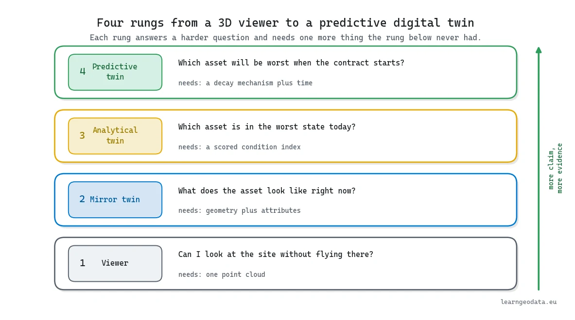
A predictive digital twin holds a model of a real asset and rolls it forward in time, which is the whole of the definition and the whole of what separates it from everything else sold under the word. It answers questions about future dates. Nothing lower on the ladder can.
Nearly everything else sold as a twin stops a rung short. A viewer lets you look, a mirror twin adds attributes you can query, an analytical twin scores the assets and ranks them by how bad they are today. All three are useful and none of them forecast anything, because forecasting needs an ingredient geometry cannot supply: a mechanism describing how the asset changes.

So use this test when a vendor says twin: ask what date it can answer a question about. If the answer is the date of the survey, you bought a viewer with good marketing. The UK National Digital Twin Programme and its Gemini Principles set out what the word is supposed to carry.
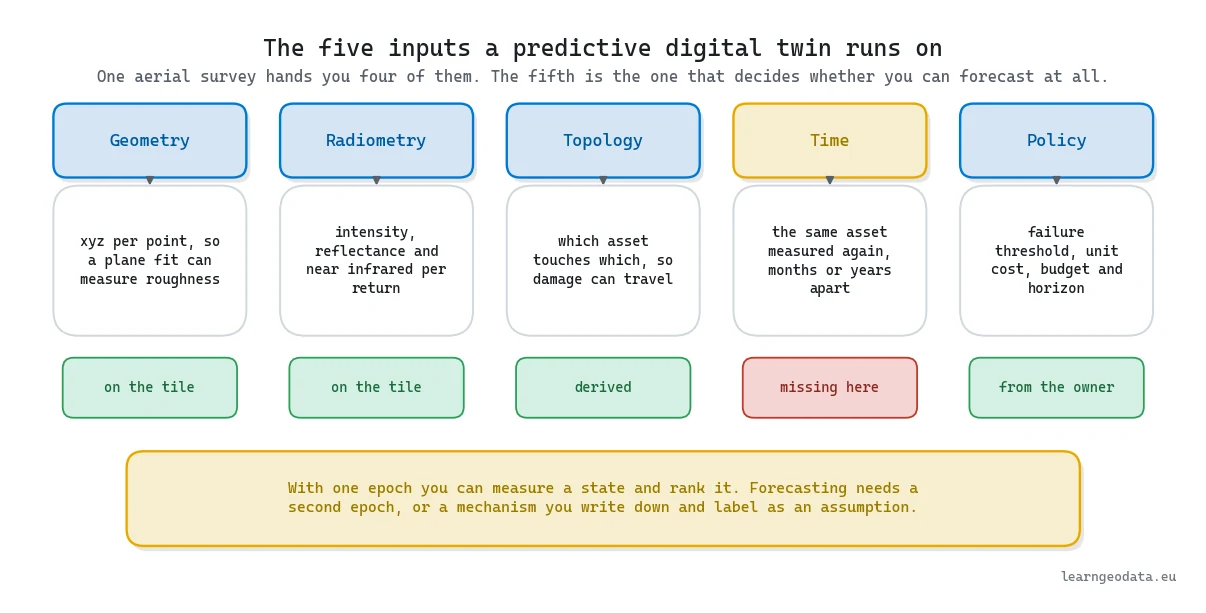
The analytical rung is where honest projects stall, and it is worth knowing why. Scoring today’s condition needs one survey, which you have. Forecasting needs a rate of change per asset, which needs two, and the gap between one survey and two is a procurement decision rather than a modelling one. Everything in this guide between here and the forecaster exists to make that second flight worth paying for.
And the forecast is never the deliverable. The deliverable is a decision that moves money, so a twin that cannot name the assets it would fund differently has done nothing yet. For the wider stack, see my complete guide to 3D spatial AI.
The Data a Predictive Digital Twin Needs
A predictive digital twin needs five inputs, and one of them never comes off a single flight. Geometry gives shape, radiometry gives material clues, topology says which asset touches which, time gives a rate of change, and policy, which nobody draws on a data diagram, decides what counts as failure and what a repair costs.
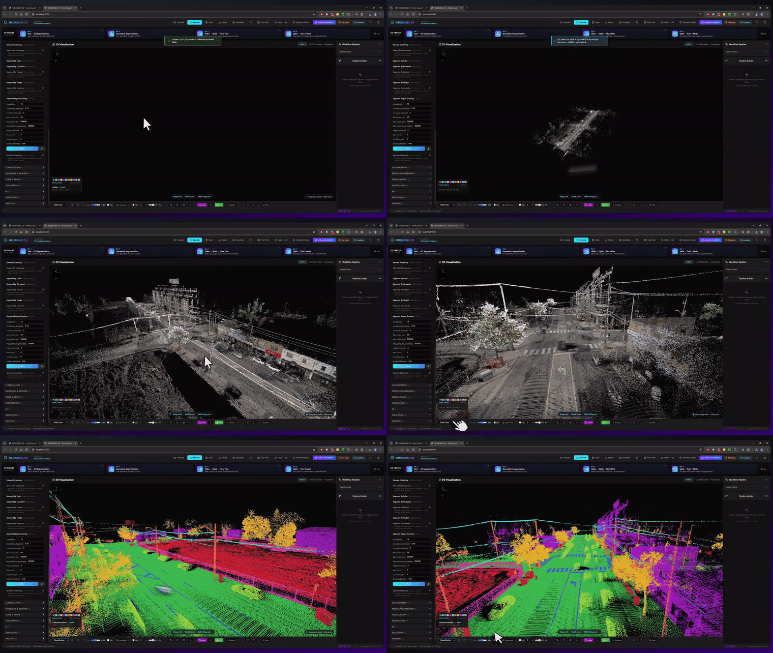
The tile here is a public Dutch aerial survey, 1040 by 1290 metres and 1,915,420 points, or 1.43 points per square metre. It carries red, green, blue and near infrared per point plus sensor reflectance, and its ASPRS classification field is entirely zero. Nothing arrives labelled, so everything the twin knows about pavement, grass or roof it has to derive.
🦥 Geeky Note: At 1.43 points per square metre a plane fit resolves shape at the decimetre scale, so you are reading camber, settlement and kerb geometry. Cracking and ravelling, everything a pavement distress manual catalogues, stays invisible. Density sets the ceiling on what your score can honestly mean.
One trap lives in the file itself. The colour channels store byte values inside 16 bit slots while near infrared arrives as an ordinary byte, so one shared divisor quietly breaks your vegetation test. Print what the fields hold instead of trusting the specification. laspy reads all of it in under a second, and open tiles like this come from AHN.
New to airborne data? The LiDAR point cloud processing guide covers that half, and this one picks up where it stops.
How to Cut a Survey Into Assets a Crew Can Reach
Cutting a survey into assets is your first real decision, because a twin reasons about assets and not about points, and the cell you choose is the smallest thing a work order can ever name.
Ground comes first, and simple beats clever. Take the lowest point in each five metre cell, median filter that raster so a car roof cannot masquerade as terrain, and anything sitting under half a metre above the smoothed surface counts as ground. You are left holding 682,045 points, a little over a third of the cloud at 35.6 percent. Narrow the band and kerbs vanish, widen it and parked cars join in.
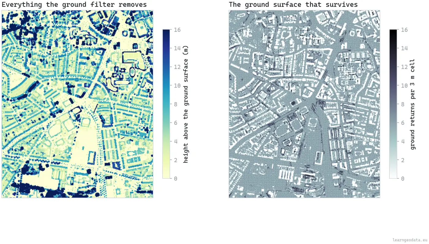
Ground still is not pavement. Grass qualifies on height and is worthless as an asset, so a near infrared minus red index per cell throws out the green stuff by ordering rather than by calibrated values.
Then you pick a cell size, and this is where beginners shrug and take a round number. Measure it instead, on your own tile, because the three candidates price out very differently.
| Cell size | Usable assets | What the statistics look like | What it costs you |
|---|---|---|---|
| 20 metres | 2,436 | Plenty of ground returns per cell, and a stable plane fit | One healthy stretch of street hides a failing one inside the same square |
| 10 metres | 7,976 | A median of only 60 ground returns per cell | Too few returns to fit a plane you would defend in a meeting |
| 12 metres | 6,181 | A median of 80 ground returns per cell | 603 cells dropped for sparseness and 2,563 for vegetation, and this is the build shipped here |
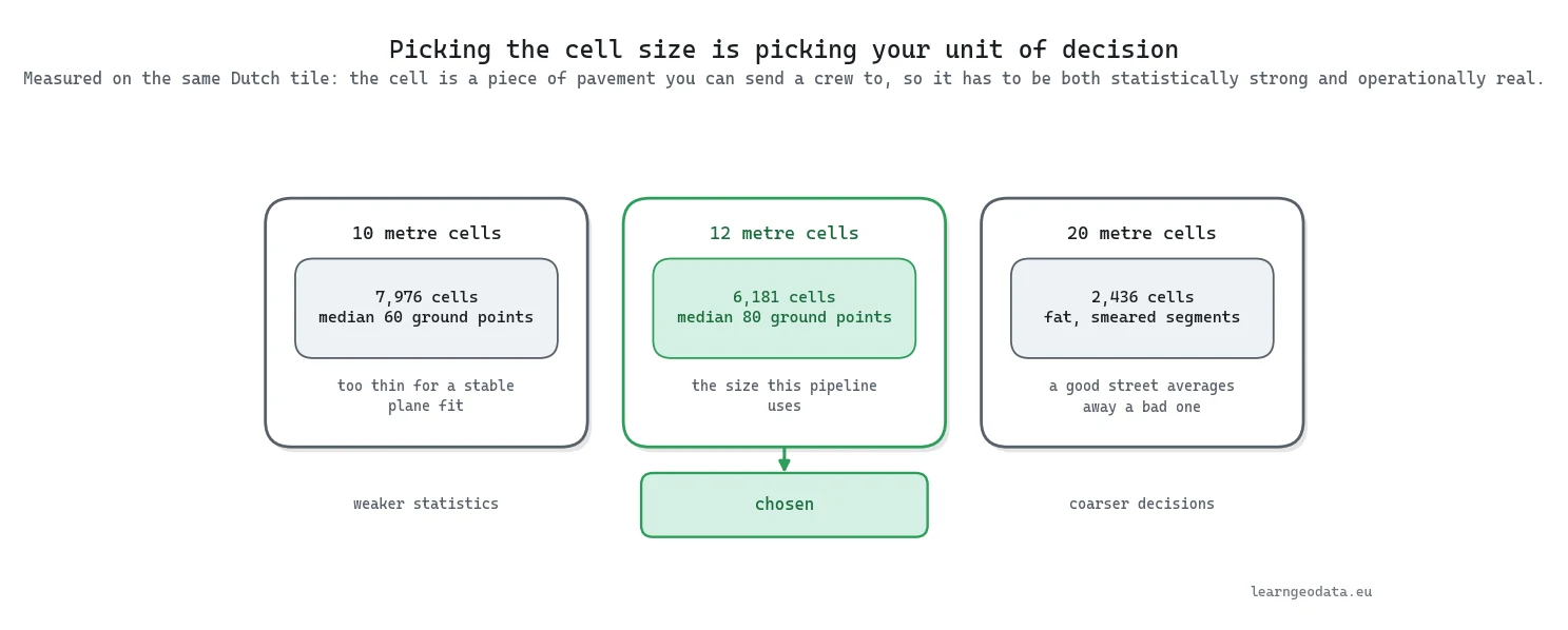
Print those two rejection counts every time you rebuild. The 603 and the 2,563 are your cheapest sanity check: a sudden jump in either one means the flight, the season or the filter changed, and you find out before the ranking does.
🪐 System Thinking Note: Granularity is a governance choice wearing a technical costume. Your cell is the smallest thing a work order can name, so pick a unit your organisation cannot act on and every ranking below it is theatre. The same rule runs through inventory systems, incident management and clustering point clouds into objects, where the grouping you choose becomes the vocabulary everyone downstream is stuck with.
How to Build a Condition Index You Can Defend
A condition index you can defend comes only from what the sensor recorded, orders the assets sensibly, and survives a question from somebody who has walked the street. Four channels do it. One eigendecomposition per cell gives the plane fit residual, which is roughness, and the eigenvalue ratio, which is planarity. The radiometric half gives the spread of reflectance and of intensity, because a surface returning five different reflectances has been patched, worn or soaked.
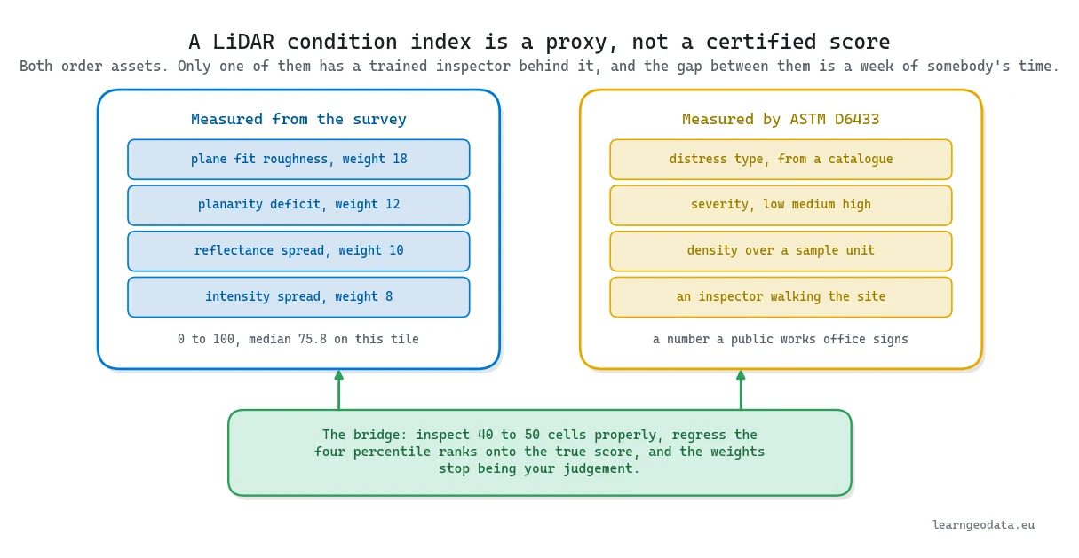
Combining them is where indices usually break. You are adding metres to a dimensionless ratio to decibels, and a weighted sum of raw values only asks which unit carries the biggest digits. Rank each channel by percentile first and your weights finally express a belief: 18 on roughness, 12 on the planarity deficit, 10 on reflectance spread, 8 on intensity spread. Scores then land between 52.3 and 99.6, with the middle cell at 75.8.
Then stress those four numbers before somebody in the room does it for you. Multiply each weight by a uniform draw between half and one and a half, hold the total at 48 so only the balance moves, and rebuild the index 500 times. The ordering hardly notices, keeping a median rank correlation of 0.991 with the shipped version. The shortlist notices a lot: the worst 350 cells, roughly what a two million euro budget can fund, keep a median overlap of only 0.879.
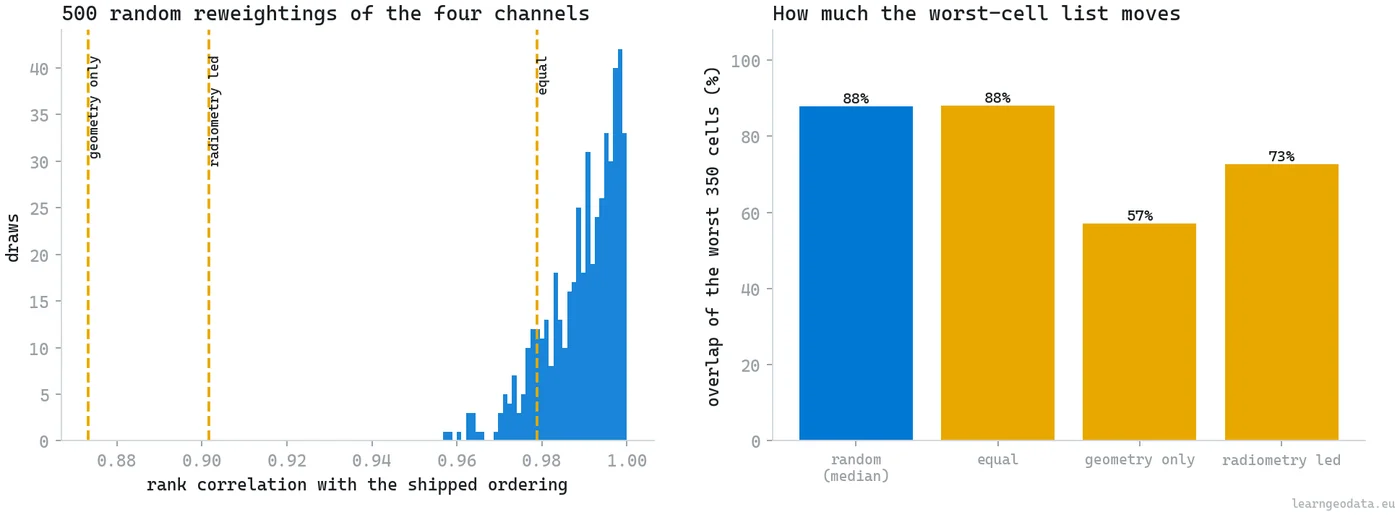
A defensible tweak to a weight you picked by judgement swings about one cell in eight right at the funding cutoff, because that is exactly where cells are packed closest together. Two numbers, 0.991 and 0.879, and the second one is the honest headline.
Be careful what you call that number. This is a proxy, and ASTM D6433 is not: that standard wants an inspector on the ground, logging distress by type and by severity. Selling a proxy as a certified score is how a good pipeline ends a bad meeting.
🌱 Growing Note: The fastest upgrade in this guide costs a week. Get 40 to 50 cells inspected properly, then regress your four percentile ranks onto the real score. My 18, 12, 10 and 8 become coefficients somebody fitted, and you move from “a defensible ordering” to “a calibrated score”, which beats any change you could make to the network later.

How to Turn Asset Cells Into a Graph With networkx
Asset cells become a graph because pavement does not fail one square at a time. Water drains along a slope, load crosses joints, and a broken cell stresses its neighbours. Modelling any of that needs topology, which is where a spatial dataset stops behaving like a spreadsheet.
The cells already sit on a grid, so adjacency costs you nothing. Call two of them neighbours when exactly one of the row or the column differs by one. That gives four connectivity, the honest choice here, since two squares meeting at a corner share no load path. Here is the construction in networkx, with real coordinates and measured condition on each node so the graph carries data rather than pointing at it.
import networkx as nx

def build_asset_graph(cells, condition):
    """Cells become nodes, four-connected neighbours become edges."""
    n = len(cells["col"])
    lookup = {(int(r), int(c)): i
              for i, (r, c) in enumerate(zip(cells["row"], cells["col"]))}

    g = nx.Graph()
    for i in range(n):
        g.add_node(i,
                   x=float(cells["center_x"][i]),
                   y=float(cells["center_y"][i]),
                   condition=float(condition[i]))

    # only two offsets: the mirrored pair would add every edge twice
    for (r, c), i in lookup.items():
        for dr, dc in ((0, 1), (1, 0)):
            j = lookup.get((r + dr, c + dc))
            if j is not None:
                g.add_edge(i, j)
    return g

# betweenness on 400 sampled sources: the ordering is stable, the cost is not
load_proxy = nx.betweenness_centrality(graph, k=400, seed=42)
Two details matter. Notice the loop walks two offsets rather than four, because adding the opposite pair would hand you every edge a second time. And betweenness is sampled at 400 sources, because the ranking consumes an ordering and an exact one costs far more. The busiest cell scores 0.08029 against a median of 0.00600, the closest thing an aerial survey has to a traffic measurement.
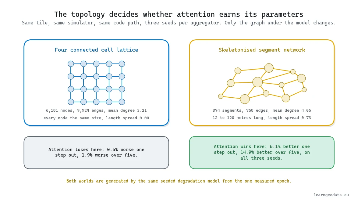
That yields 9,924 edges over the 6,181 nodes, a mean degree of 3.21, and 83 disconnected pieces with 5,955 cells in the biggest. Fifty cells finish with no neighbour at all, and you leave them in, because a model that never meets one in training will meet one in production. Report what they cost you, too, instead of letting them hide inside an average: split out, the held out error runs 0.4327 condition points over the 6,131 connected cells against 0.4448 over the 50 isolated ones, so they are marginally harder and eight tenths of one percent of the network.
The lattice is not the only graph those cells can carry, and the alternative matters more than it looks. Skeletonise the paved mask down to a one cell wide centreline, cut it wherever three or more skeleton pixels meet, and every surviving run becomes a segment that absorbs the cells nearest to it. Same pavement, same measurements, 374 segments instead of 6,181 squares, running 12 to 120 metres long with a mean degree of 4.05. Hold onto that second topology, because two sections from here it settles an architecture argument this guide used to get wrong.
Declaring the Degradation Mechanism Instead of Hiding It
Declaring the degradation mechanism is the part of this guide to copy even if you throw away everything else. You have one epoch. To forecast anything you need a mechanism, and there are two options: measure it from repeat surveys you do not have, or write it down and label it.
Writing it down is the only defensible move, so the simulator reads epoch zero plus the per cell properties and rolls out 24 half-year steps. Sixteen named parameters, one fixed seed, every value printed before anything gets generated.
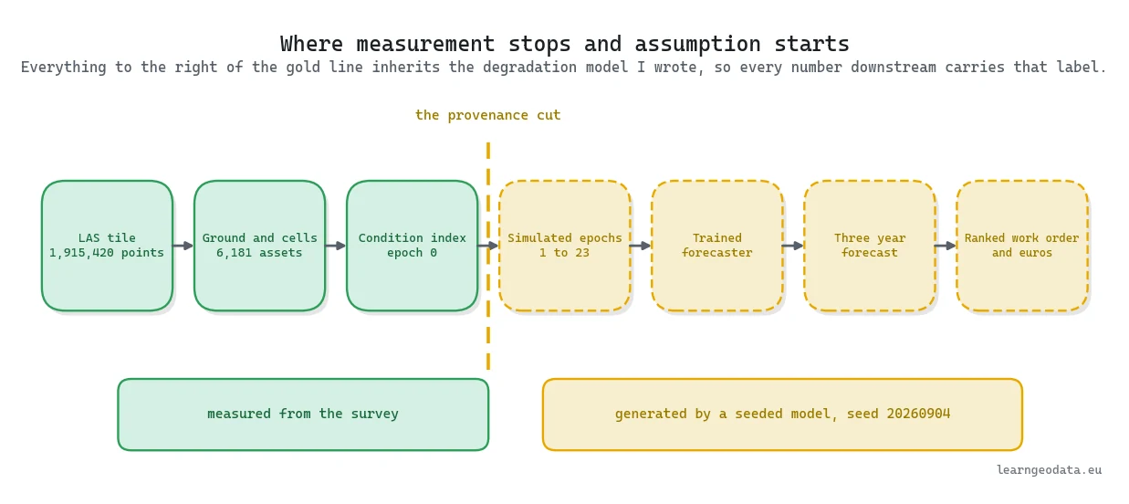
Three choices in that block matter more than the rest. Decay speed leans on traffic, slope and mean reflectance, then on roughness with the smallest of the four coefficients. That last term deserves a flag, because roughness also carries the heaviest weight inside the condition index, so the separation between “worst today” and “worst in three years” is partial rather than clean. Measure it instead of claiming it: the rank correlation between the epoch zero index and the generated decay rate comes out at minus 0.252, an R squared of 0.0886, so today’s state accounts for 8.9 percent of tomorrow’s speed.
Coupling looks at a cell’s worst neighbour instead of averaging them, exactly the pattern a weighted aggregation should catch. And a pair of noise terms, one per cell plus one shared across the tile, sets a ceiling on any forecast built here.
The base rate is 1.35 condition points per year, clipped between 0.45 and 2.60 so the z score composition cannot produce silly values. The median comes out at 1.23, walking the median cell from 75.8 today to 48.3 after twelve simulated years. Plausible lifecycle numbers, and plausible is as strong a word as I will use.
🦚 Florent’s Note: The failure mode I have watched play out more than once is not technical. The notebook is honest, the parameter block is printed, and by the time it reaches a slide it reads “validated on twelve years of survey data”, because nobody enjoys typing “validated against data we made up”. A provenance chain is only as strong as its weakest link, and mine is labelled with a random seed.

Writing the Graph Attention Layer in Plain PyTorch
A graph attention layer is four operations long and you do not need a graph learning library to write it. There is no torch_geometric in this environment, and skipping one teaches you more anyway. Type those four operations once with your own fingers and the phrase “message passing” stops being vocabulary and becomes something you can picture.
It traces back to Graph Attention Networks. A plain graph convolution just averages whatever neighbours a node has and gives each an equal say, fine when they are interchangeable and wrong when one is a failing joint and another a fresh overlay. Attention lets the node decide. Here is one forward pass, and the one subtle piece is the segment softmax: each node normalises only the edges arriving at it, never the global edge list.
import torch
import torch.nn.functional as F

def attention_forward(x, edge_index, proj, a_src, a_dst, skip,
                      heads=4, slope=0.2):
    """One multi-head graph attention pass, written out in plain torch."""
    n = x.shape[0]
    src, dst = edge_index[0], edge_index[1]
    dim = proj.out_features // heads

    h = proj(x).view(n, heads, dim)                     # project every node
    score = F.leaky_relu((h[src] * a_src).sum(-1)
                         + (h[dst] * a_dst).sum(-1), slope)   # score per edge

    # segment softmax: subtract a per-node maximum before exponentiating
    top = torch.full((n, heads), -1e30, device=x.device)
    top = top.scatter_reduce(0, dst.unsqueeze(-1).expand_as(score), score,
                             reduce="amax", include_self=True)
    ex = torch.exp(score - top[dst])
    den = torch.zeros((n, heads), device=x.device).index_add_(0, dst, ex)
    alpha = ex / (den[dst] + 1e-16)                     # 1e-16 saves isolated nodes

    msg = alpha.unsqueeze(-1) * h[src]
    agg = torch.zeros_like(h).index_add_(0, dst, msg).reshape(n, -1)
    return F.elu(agg + skip(x))                         # the residual is not optional
Project, score, normalise, aggregate. Two pieces are easy to skip and expensive to skip: the tiny constant in the denominator, which stops an isolated node dividing by zero, and the residual on the last line. Take the skip away and each node gets dragged towards the average of its two hop neighbourhood, which is a low pass filter, and the cells you were hunting for are the first thing it erases. scatter_reduce gives the per node maximum for numerical stability in one call.
🦥 Geeky Note: Count the weights and you get 6,401, which is less than a first embedding layer in a typical text project. Its input vector is 24 long: six condition values, five deltas, thirteen standardised statics. The stacked graph holds 26,029 directed edges, 6,181 of them self loops, and those matter, since a node with no self edge cannot attend to itself. Full batch training stops itself after 113 optimisation steps on a CPU, with the validation loss bottoming out at 0.0398, and both figures come back identical on a rerun. The wall clock does not, so do not quote one.
What you feed it matters more than how many heads it has. The input vector here is 24 numbers wide and it splits three ways: six observed condition values, five deltas between consecutive epochs, and thirteen standardised statics that never change with time. The deltas are the half doing the work, because a condition level tells the network where a cell is and only a delta tells it where the cell is going. Standardise the static block on the training portion alone, exactly as you would anywhere else, or the scaling constants become the leak nobody sees.
One more decision worth stealing: the head predicts the change in condition, not the condition itself. Ask for the level and your network can look excellent by echoing what it was handed, which is exactly the trick persistence performs at no cost, and your loss curve will keep the secret.
How to Evaluate a Spatiotemporal Forecast Honestly
An honest spatiotemporal forecast evaluation holds out epochs rather than cells, and compares against what the asset owner already has for nothing. Both of those get answered wrong constantly, and each one on its own is enough to make a result meaningless.
Hold out cells while keeping every timestamp and the model learns how the whole network behaved across the test window, knowledge it will never hold on deployment day. Nothing looks wrong either, since no row is duplicated across the splits. Hold out epochs instead and the test finally poses the question a city pays for: everything up to today is on the table, so what does next year look like?
Then pick the comparison. Not another neural network, but the two things the owner can run for free. Persistence says next epoch looks like this one, and it is brutally strong over short horizons. Linear extrapolation fits a least squares slope over the same six epoch window, and that is the one that hurts, because short run deterioration really is close to linear.
Give the baseline the same history window the model gets. Hand it two points while your network sees six and you have rigged the comparison, which happens in published work more often than it should.
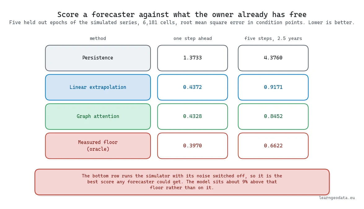
Then add the one comparison a generated world lets you build and a real one does not. Run the same degradation function with both noise terms switched off and you have an oracle: a forecaster that knows the mechanism exactly and still cannot beat the randomness sitting on top of it. That floor measures 0.3970 one step out and 0.6622 over five, and it reframes every number below. A model at 0.4328 is not 43 hundredths away from being right, it is 9 percent away from the best score anything could ever post on this data. Publish the floor beside the result and a modest figure stops looking like a failure.
Then assert the split in code rather than trusting your eye over it. A temporal split can spring three separate leaks. Two sets can share a target epoch. An input window can stretch forward over the very epoch it is meant to predict. And your scaling constants can be derived from the full series, held out portion included, which is the one that leaves no trace in any single row. Fixed constants rather than series statistics close that third door by construction.
Writing those assertions caught a live leak in this very pipeline. The roll out used to begin at epoch 17 and score epoch 18, and epoch 18 is one of the two validation targets early stopping uses to choose the checkpoint, so the forecast was being graded on an epoch that had picked the model. It now starts at 18, observes it the way a deployment would, and scores 19 through 23. Every multi step figure below moved when that was fixed.
🪐 System Thinking Note: Whatever you compare against is doing half the work of defining the problem, so choose it deliberately. Persistence measures how much of your apparent skill is plain inertia. And when you wrote the mechanism yourself, you can build a comparison nobody working from real epochs can: run the same function with both noise terms switched off and you have an oracle, whose error is the floor of the problem. Adding the two noise standard deviations of 0.35 and 0.25 in quadrature predicts 0.4301, and the oracle actually measures 0.3970 one step out and 0.6622 over five. Which puts the model’s 0.4328 about 9 percent adrift of the best result anything could achieve here.
🦥 Geeky Note: Two checks worth running on your own pipeline tonight, since both of these bugs got past me for a while. First, print the first epoch your roll out scores and compare it against every epoch that influenced checkpoint selection. If they touch anywhere, your multi step number is flattering you. Second, print the parameter count off the trained object and never off a freshly built probe. The figure in this guide read 9,537 for months because the probe was constructed at the constructor’s default hidden width of 64 while training ran at 48. The real count is 6,401. The trained network was always the smaller one and every accuracy figure was always right, so nothing in the results moved, which is precisely why no reader could have caught it.
What the Numbers Said and What They Did Not
Every figure in this section was measured on a simulated series, and that sentence has to travel with the numbers wherever they go. The tile was flown once. A second real survey would delete the rate assumptions, since decay per cell becomes something you measure. A third would expose curvature, free up a genuine held-out epoch, and turn the error bar into a measurement instead of a guess.
Across five held out epochs and all 6,181 cells, one step ahead: persistence lands at 1.3733 root mean square error, linear extrapolation at 0.4372, the graph attention model at 0.4328. Roll it five steps out instead, feeding each prediction back into the next input, and you are two and a half simulated years ahead: persistence falls apart at 4.3760, linear extrapolation holds 0.9171, the model reaches 0.8452. Quote the multi step number, because nobody holds next season’s survey when they write next year’s budget.
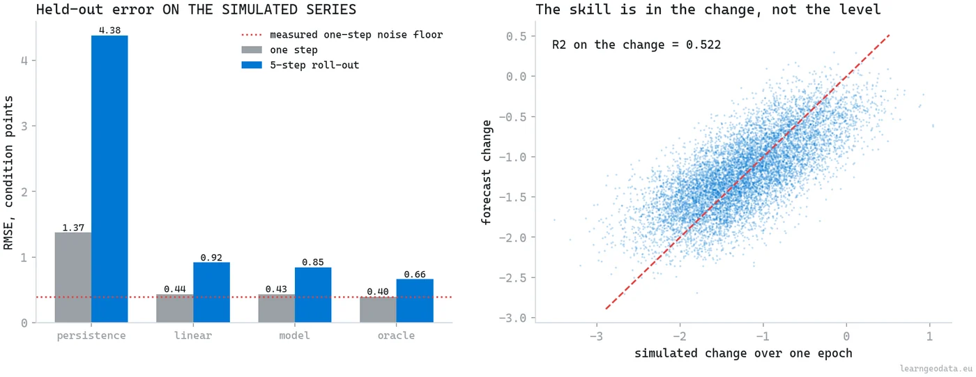
Read the one step column honestly and it says the network bought you almost nothing over a straight line. That is the correct reading and it is not a disappointment, because the straight line is what the oracle floor allows: at 0.3970 there is barely room between a least squares fit and perfection. The five step column is where a model earns a fee, and even there the margin over linear extrapolation is 0.8452 against 0.9171.
One more thing the same harness answered cheaply. Look at what sits in the static block: betweenness, slope, mean reflectance and roughness. Those are precisely the inputs the decay rate was built from, so this generated world quietly hands the forecaster the recipe it is being asked to infer, with no measurement error on it. Drop betweenness, the strongest of the four, and retrain: the one step error improves from 0.4328 to 0.4270. The work is being done by the observed history rather than by a leaked static, which is the reassuring answer and not the one I expected.
For calibration, a digital twin study using a graph neural network on pavement condition reports an R squared of 0.3798 while still beating its baselines, and a spatiotemporal graph attention model for pavement distress lands in the same modest territory. Deterioration forecasting is noisy, honest numbers look unimpressive, and a paper claiming otherwise deserves a hard look at its splits. If you want to go deeper on how a spatial model gets scored at all, my 3D deep learning guide takes that apart.
Which Graph Aggregator Your Topology Deserves
Your graph decides whether attention is worth its parameters, and one tile can answer the question both ways. Swap attention for a plain mean over exactly the same edges, retrain with everything else untouched, and run three seeds per aggregator rather than one, since two networks trained once apiece differ by their starting weights as much as by their architecture.
On the cell lattice, attention averages 0.4349 one step and 0.8668 over five, against 0.4328 and 0.8504 for the plain mean. Attention comes out 0.5 percent and 1.9 percent worse. It bought nothing there, and it cost a little. Worth one footnote so the two tables do not look like they contradict each other: the 0.4328 quoted in the previous section is the attention model’s single shipped seed, which happened to land at the good end of its spread, while 0.4349 is the three seed mean, and only a mean belongs in a comparison.
The old version of this guide stopped there and explained the tie away by pointing at the lattice, which was an excuse wearing the costume of a hypothesis. So I built the graph that tests it: the 374 segment network from earlier, nodes running 12 to 120 metres with a size spread of 0.73 against exactly 0.00 for the squares, mean degree 4.05 against 3.21. Same simulator, same seed, same split, same code path, a second generated world rather than a real one. On that graph attention averages 0.6058 one step and 1.5048 over five, the plain mean 0.6449 and 1.7691. Attention is 6.1 percent and 14.9 percent better and it wins all three paired seeds in both metrics. A clean sign flip, on the only variable that changed.

So measure the graph before you pick the aggregator, and the decision reduces to two properties you can compute in a minute.
| Your topology | Node size spread | Measured error, one step and five steps | What to run |
|---|---|---|---|
| 6,181 identical lattice squares, mean degree 3.21 | 0.00 by construction | Attention 0.4349 and 0.8668, plain mean 0.4328 and 0.8504 | The plain mean. Interchangeable neighbours give attention nothing to learn |
| 374 segments running 12 to 120 metres, mean degree 4.05 | 0.73 | Attention 0.6058 and 1.5048, plain mean 0.6449 and 1.7691 | Attention, 6.1 and 14.9 percent ahead, winning all three paired seeds |
| Either one, before you own a network at all | Whatever you measured | Linear extrapolation 0.4372 and 0.9171 on the lattice, 0.5558 and 1.0197 on the segments | The straight line, until a network beats it on your own split |
Two caveats travel with that headline and leaving either out would make it dishonest. Start with the one that stings, and it is the third row above. Linear extrapolation on the segment graph scores 0.5558 one step and 1.0197 over five, which neither aggregator gets near. Merging those 6,181 squares down to 374 segments buys nodes that mean something and charges you sixteen times fewer training examples for them, 4,114 node epochs where the lattice had 67,991. Feed a 6,401 parameter network four thousand samples and you are no longer in the regime it was doing well in. So the layer that wins the ablation is the layer you would still refuse to ship, and both of those facts come off the same run.
The second: difficulty and heterogeneity are tangled together in this design. Measured against each world’s own oracle floor, attention sits 9.5 percent above it on the lattice and 27.4 percent above it on the segments, so the harder world also leaves more room for any difference at all to become visible. Two topologies cannot pull those two explanations apart, and I am not going to pretend otherwise.
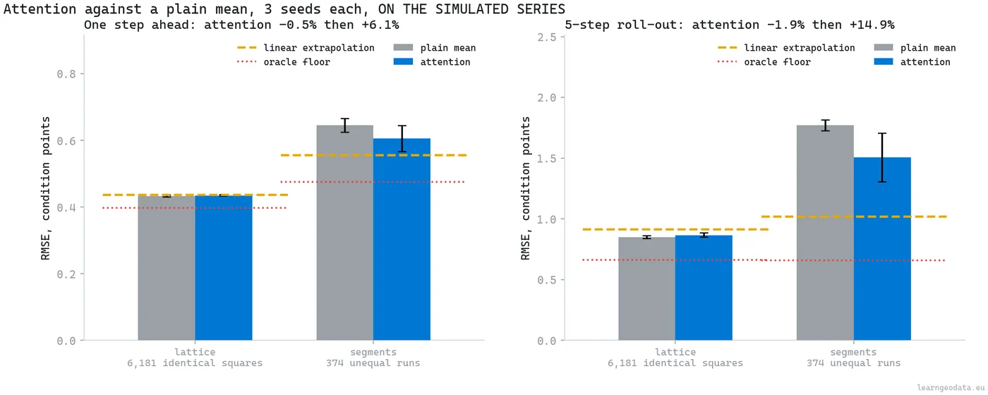
Run the ablation with three seeds per arm at minimum whenever your nodes do differ in size and in degree, because one run per arm over a few hundred nodes will hand you anything from a large win to a large loss and no way to know which you drew.
How to Turn a Predictive Digital Twin Into a Work Order
A predictive digital twin becomes a work order when the forecast turns into a sortable number and a budget that binds. A forecast that stops at a colour map is a demo, and you have not finished.
Benefit multiplies three quantities: how far the forecast falls under the threshold, the paved area actually measured for that cell, and a centrality weight so a through route outranks a dead end in the same state. Take the same area, multiply by a unit resurfacing rate, and you have the price. Sort by benefit per euro, fill greedily, stop when the money runs out. Four policy numbers drive it and every one belongs to the asset owner: threshold 40, unit cost 48 euros per square metre, centrality weight 1.5, budget two million euros.
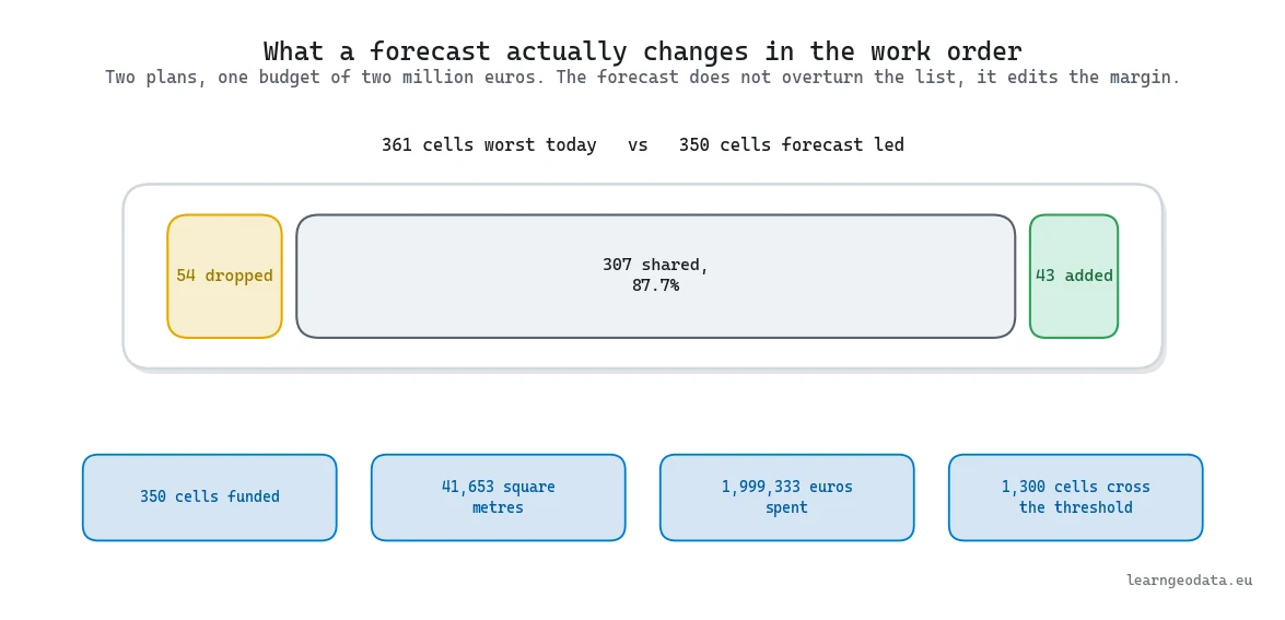
Now the comparison that decides whether any of this was worth doing. Right now 1,655 cells fail the threshold, and three years out the model has 2,955 failing, so roughly 1,300 fall over the line inside the horizon. Spending forward buys 350 cells across 41,653 square metres, at a cost of 1,999,333 euros. Spending on today’s worst buys 361 cells for nearly the same money, and 307 of them show up in both lists, 87.7 percent of the forward plan.
Read that honestly. Forecasting did not overturn the work order, it swapped 54 cells out and 43 in, which sounds underwhelming until you price it. Those 43 would have failed between this contract and the next, and mobilising a crew again for them is the cost your client cares about.
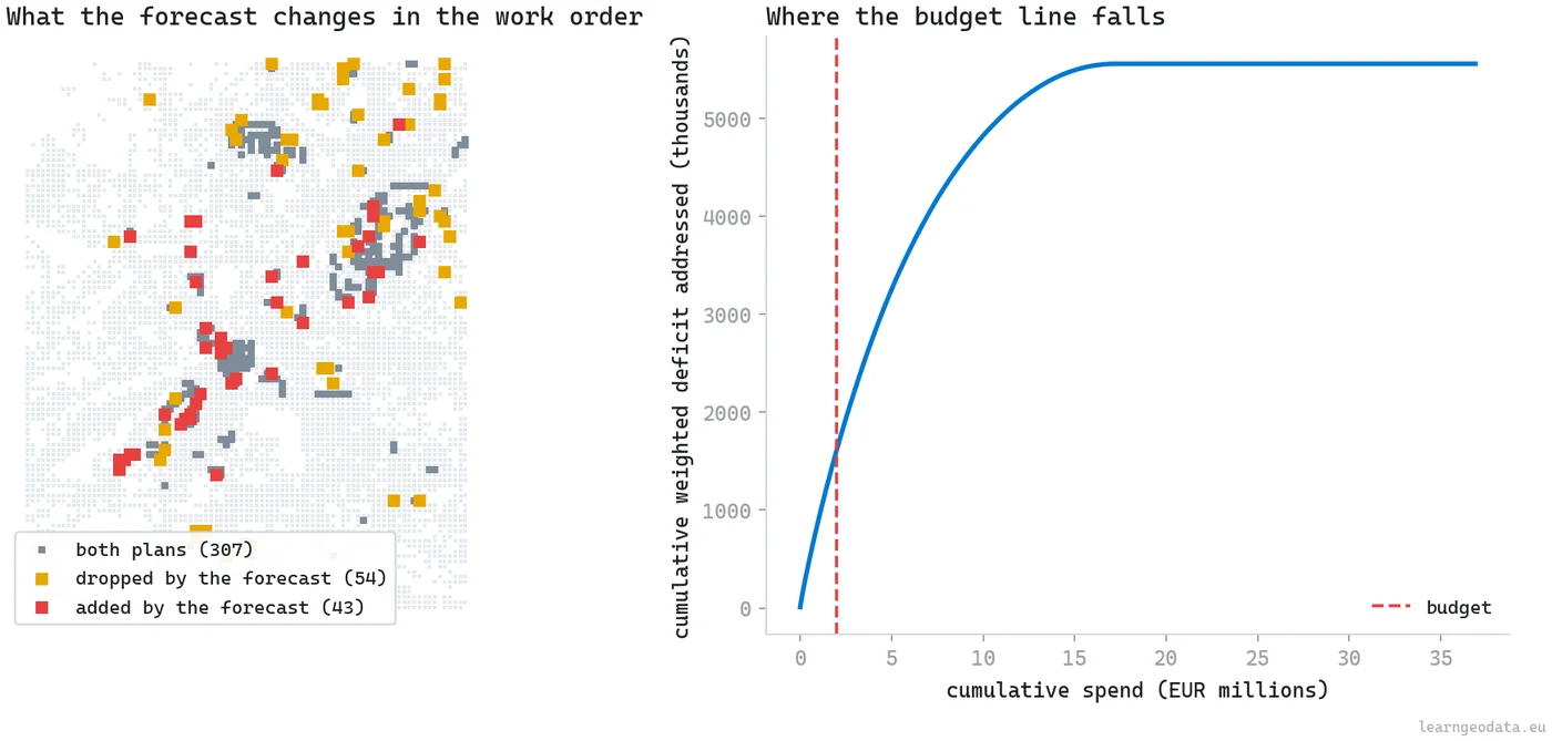
And that 87.7 percent is not a disappointment. It is the 8.9 percent from the mechanism arriving where the money is. Today’s measured state and the speed the simulator generates share about a tenth of their variance, so the two plans are obliged to agree on the bulk of the list and to differ at the edges. A twin that reshuffled every cell would be telling you its mechanism had lost contact with the measurement it started from, which is worse news rather than better.
Now push those four index weights all the way through to the money, since the ranking depends on them and they were a judgement call. Rerun the entire chain under three deliberate rebalances, each one generating its own history and training its own forecaster before it fills the same two million euros. Measured against the plan this guide ships, an equal weighting retains 94.3 percent of the funded cells. Leading with radiometry retains 84.9 percent. Zeroing both radiometric channels retains 76.0 percent. Which puts a price on the judgement: somewhere between 6 and 24 percent of the budget, call it 120,000 to 480,000 euros, gets spent on a different set of streets depending on four numbers nobody measured. Nothing else in this guide makes a stronger case for getting fifty cells inspected properly.
🌱 Growing Note: Sorting greedily by benefit per euro solves the fractional knapsack exactly and the integer one only approximately. Hand 6,181 binary variables to OR-Tools or PuLP and it closes in seconds, with room for the constraints a city really has: a cap on open sites, neighbouring cells grouped into a single visit, a floor on spend per district. That last one belongs to politics rather than engineering, and any model with no way to say it out loud gets quietly overridden in a meeting.
One panel in that figure deserves a harder look than it usually gets, and it is the benefit curve on the right. Two million euros lands low on the steep part of it, which means the marginal euro is still buying a lot of avoided failure when the budget runs out. Say that out loud to your client rather than burying it. A ranking that stops on the steep part is telling you the constraint is the money and not the model, and no amount of forecasting accuracy changes where that line falls.
Then write the state out where somebody can open it: a polygon per cell in the projected national grid, a copy reprojected to WGS84 for the web map, each carrying the condition now, the forecast, and a funded flag. Treat the projected file as authoritative, since degrees measure neither area nor distance in metres.
Five Predictive Digital Twin Mistakes and How to Fix Them
Five mistakes account for nearly every broken predictive digital twin project I have looked at, and every one of them shows up as a number somewhere in the run rather than as an error message.
Laundering the Simulator Into a Slide
A generated history is a legitimate engineering tool and an indefensible marketing claim, so the disclosure has to survive the trip to the deck. This build printed sixteen named parameters and a fixed seed before it generated anything, and every accuracy figure in the guide was scored on the epochs that came out. The fix is mechanical: put the provenance sentence in the same paragraph as the number, never in a footnote, and it stops getting separated from it.
Splitting in Space Instead of Time
Holding out cells while keeping every timestamp produces beautiful metrics that evaporate on deployment, and no duplicated row ever shows up to warn you. Assert the split in code instead. Doing that here caught a real leak: the roll out began at epoch 17 and scored epoch 18, which is one of the two validation targets early stopping uses to pick the checkpoint, so every multi step figure moved once it was fixed to start at 18 and score 19 through 23.
Predicting the Level Instead of the Change
A model asked for the condition level can look excellent by echoing what it was handed, which is precisely the trick persistence performs for free. Persistence scored 1.3733 one step out and 4.3760 over five here, so the gap between a copier and a forecaster only becomes visible once you predict the change and roll it forward. Ask the head for the delta and your loss curve stops keeping the secret.
Deciding an Architecture From One Run Per Arm
Over a few hundred nodes the random seed moves the answer further than the architecture does, and this pipeline proved it twice. Three seeds per aggregator put attention 0.5 and 1.9 percent behind a plain mean on the lattice and 6.1 and 14.9 percent ahead on the 374 segments, a clean sign flip on the only variable that changed. One run per arm would have licensed either headline.
Selling a Proxy Index as a Certified Score
An index built from four sensor channels orders assets defensibly and certifies nothing, and the distance between those two words is where meetings go wrong. Five hundred defensible reweightings hold a median rank correlation of 0.991 while the funded shortlist keeps only 0.879 of its members, and rebalancing the weights moves 6 to 24 percent of a two million euro budget onto different streets. Get 40 to 50 cells inspected and the proxy becomes a calibrated score.
🦚 Florent’s Note: Actually, let me correct that ordering, because I listed them the way an engineer would. The expensive failure is none of the code ones. It is a twin whose smallest unit nobody can dispatch a crew to, so the ranking gets admired once and ignored while the same three streets get resurfaced as usual. Ask what the work order looks like before your first line of ingestion code. The point cloud to mesh guide covers the delivery side.
Where to Go Next With Your Predictive Digital Twin
The expensive half of a predictive digital twin runs exactly once. Ground extraction, the cells, the graph, the index and the export files are all epoch independent, so they cost one build and then run free every time a flight lands. The forecaster is the cheap half, it improves with every epoch that lands, and the simulator loses ground until there is nothing for it to do.
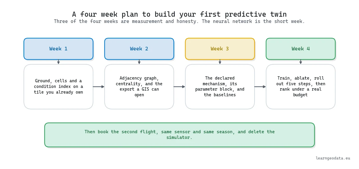
So start with a tile you own and build the boring part: ground, cells, a condition index with weights you can argue for. That runs in minutes on a laptop and hands a colleague something concrete to argue with, and that argument is where every working system I have seen started.
Then book the second survey. Same sensor, same season, same flight lines, and a date you cannot ignore, because comparability across epochs is worth more than resolution within one and hardly anybody is procuring for it yet.
Write down what that second flight retires while you are still waiting for it. The sixteen simulator parameters go first, because a decay rate per cell becomes something you measure. The minus 0.252 rank correlation between today’s index and tomorrow’s speed becomes a measurement rather than a design choice, and so does the 87.7 percent overlap between the two work orders that falls out of it. Keep the list somewhere visible: it is the clearest statement anybody in your organisation will ever see of what a survey is actually worth.
When that second epoch lands, the simulator retires and the work becomes measurement. I wrote the practical half of that transition as Smart 3D change detection, a Python tutorial for point clouds on Medium, which is how you get a real rate per asset out of two surveys instead of assuming one. The rest of what I publish there is at medium.com/@florentpoux.
For a structured path through the whole stack, the 3D AI Program is where I teach this end to end, from capture through spatial reasoning to the systems that carry a decision. To try the ground floor free first, the free mission gives you three questions, a roadmap and five build missions.
The underwriters at Lloyd’s committed to a class and let the sea test it. So here is my question back to you: what condition forecast are you willing to write down, date, and be scored against when the next survey lands?
Frequently Asked Questions About Predictive Digital Twins
How Long Does It Take to Build a Predictive Digital Twin?
Roughly a month of focused work on data you already hold, and the split is not what people expect. Three of those weeks go into ground extraction, asset cells, the condition index, the graph and the export, while training and evaluating the forecaster is the short week. The forecaster here converges in 113 optimisation steps on a laptop CPU, which tells you where the effort really sits.
What Accuracy Should You Expect From a Spatiotemporal Forecast?
Lower than the marketing suggests, which is normal for deterioration problems. A published digital twin study using a graph neural network on pavement condition reports an R squared of 0.3798 while still beating its own baselines. What matters is not absolute accuracy but how far you beat persistence and linear extrapolation over the same history window. Here that was 1.3733 for persistence and 0.4372 for a straight line, against 0.4328 for the network.
Does Graph Attention Beat a Plain Neighbour Average?
It depends on the graph, and one tile can answer both ways. Over a four connected lattice of identical cells, three seeds per aggregator put attention 0.5 percent behind a plain mean one step out and 1.9 percent behind over five, so the extra parameters buy nothing. Rebuild the same pavement as 374 unequal segments, change nothing else, and attention moves to 6.1 percent and 14.9 percent ahead, winning every paired seed. Both sets of figures were scored on generated series. Measure how unequal your nodes are before you decide.
Is a Simulated History Ever Acceptable in a Digital Twin?
Yes for building and testing machinery, never as evidence about the world. A seeded, documented simulator with printed parameters lets you develop the whole pipeline before your second survey exists. It stops being acceptable the moment a forecast derived from it is presented without saying where the history came from.
How Many Survey Epochs Do You Need Before You Can Forecast?
Two epochs make a per asset decay rate measurable, so the rate assumptions leave your model. Three make curvature measurable and let you hold one epoch out for a real test. One epoch gives a measured state and an assumed mechanism, enough to rank assets today and not enough to validate a forecast.
Which Python Libraries Do You Need for a Predictive Digital Twin?
Eight, none exotic: laspy for the survey file, SciPy for raster filtering, networkx for the graph and centrality, PyTorch for the model, shapely and pyproj for export geometry, scikit-image to skeletonise the paved mask into segments, and Open3D for an interactive replay. No graph learning library is needed, since the layer is forty lines of core PyTorch.
Does a Predictive Digital Twin Need a GPU?
Not at this scale. The model has 6,401 parameters and converges on a CPU in 113 optimisation steps over 6,181 nodes and 26,029 directed edges, and pinning it to the CPU makes reruns bit identical. A GPU starts to matter at millions of nodes or with nightly retraining, and by then the bottleneck is usually ingestion rather than the optimiser.

